Visual Testing in Software | The Problem I Couldn't See
When you're working with large amounts of code that primarily deals with geometry, it isn't always easy to make changes or understand the logic at a glance—even though it's usually doing something simple: creating a couple of lines and points.
You might have 1,000 lines of code that generates one simple geometric representation. Even if you wrote the code yourself, you're often missing the big picture by just reading it line by line.
I learned this lesson when I inherited some particularly complex code. Reading through it line by line wasn't enough. The logic was sound, the implementation was smart. I had to understand it first to be able to make changes to it, but understanding what it actually did required something more—something I had already been doing while developing.
I'd been visualizing it on paper and whiteboards.
I was making changes to the code, but even with unit tests, I wasn't quite sure if the big picture remained intact.
I needed to see the code!
But often in a cloud-based application, visualizing something requires so much work and wiring to make it visually available in the system. After all that effort, you don't really want to keep it in your codebase—it's just for you to test some piece of code.
I know what you're thinking: good code should be readable. Yes, I agree!
Clean code is important. But when working with geometry, it's not just the logic that matters—the end result is what's important, and you need to see it somehow. This approach isn't limited to geometric and spatial data either. Complex logic that depends on relationships between different elements can be visualized too. You can use it in signal processing, statistics, or anywhere the results have patterns or the generated data has a shape you can test visually.
For these problems, reading code is like trying to understand a sculpture by reading a description of it. You might get the idea, but you won't really see it.
In Farsi, there's a saying: "Hearing is never like seeing."
The Moment of Realization
I spent hours trying to understand code I'd written 8 months ago—or worse, complex code written by others. We've all been there. While trying to understand the code, I had a simple idea: what if I could visualize what the code was doing at each step? Then I would
- understand the code more easily, and
- when making changes, see whether I was on the right track.
I don't know if this is a common practice, but it helped me and later helped others write better code.
The concept is simple: write tests that produce visual output alongside their assertions.
import matplotlib.pyplot as plt
import numpy as np

def test_rotation_visual():
    points = np.array([[0, 0], [1, 0], [1, 1], [0, 1], [0, 0]])

    angle = np.pi / 4
    rotation_matrix = np.array([
        [np.cos(angle), -np.sin(angle)],
        [np.sin(angle), np.cos(angle)]
    ])
    rotated = points @ rotation_matrix.T

    fig, (ax1, ax2) = plt.subplots(1, 2, figsize=(10, 5))

    ax1.plot(points[:, 0], points[:, 1], 'b-o', label='Original')
    ax1.set_title('Before Rotation')
    ax1.axis('equal')
    ax1.grid(True)

    ax2.plot(rotated[:, 0], rotated[:, 1], 'r-o', label='Rotated 45°')
    ax2.set_title('After Rotation')
    ax2.axis('equal')
    ax2.grid(True)

    plt.savefig('test_outputs/rotation_test.png')

    assert rotated.shape == points.shape
And the result for the test generates the below image:
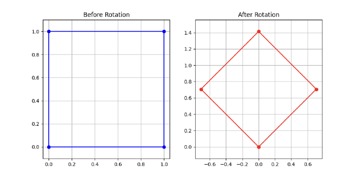
Wasn't that just much easier?
This test does two things:
- Makes standard assertions (the shape is preserved)
- Produces a visual artifact you can inspect
When the test runs, you get an image showing exactly what the transformation did.
When Visual Tests Became Essential
Visual tests became truly valuable when dealing with algorithms that had multiple interacting components. When you have systems where components affect each other—like constraints in a spatial system—visual tests show the relationships clearly:
def test_constraint_system_visual():
    # Setup elements with constraints
    elements = create_test_elements()
    constraints = apply_constraints(elements)

    # Visualize before and after
    fig, axes = plt.subplots(1, 2, figsize=(12, 6))

    plot_system(elements, constraints, axes[0], title='Initial State')

    resolved = resolve_constraints(elements, constraints)
    plot_system(resolved, constraints, axes[1], title='After Resolution')

    plt.savefig('test_outputs/constraint_system.png')
The Unexpected Benefits
1. Documentation That Can't Go Stale
The visual outputs are always in sync with the code because they're generated by it. Unlike diagrams in documentation, they can't become outdated.
2. Cross-Disciplinary Communication
When working with domain experts who aren't software engineers, visual tests bridge the gap. They can verify the logic is correct by looking at the output, without reading code. A domain expert once told me: "I can't review your code, but I can tell you if it looks right."
3. Confidence to Refactor
Visual tests give you confidence that refactoring didn't change behavior. The assertions might pass, but if the visual output looks different, something subtle changed.
4. Faster Debugging
When a bug appears, the visual test immediately shows where the logic diverged from expectations. No more adding print statements or stepping through a debugger for 20 minutes.
How to Implement This in Your Project
- Use matplotlib or Plotly as the main libraries to generate images
- Create a directory for outputs (e.g.,
/test_outputs) and add it to your.gitignorefile - Based on the output you're getting, create helper functions to generate visualizations easily
Optional Enhancement: You could also add this to your CI and compare generated images to a checked-in reference image, this s something I thought of but never really tried but technically it should work well and you can automate these tests.
def images_are_similar(img1_path, img2_path, threshold=0.95):
    """Compare two images for similarity."""
    img1 = np.array(Image.open(img1_path))
    img2 = np.array(Image.open(img2_path))

    # Calculate similarity metric
    similarity = calculate_similarity(img1, img2)
    return similarity > threshold
Handy Tips
Use Subplots
Show before and after states, or show progression through steps. This makes the visualization more informative.
Add Annotations
Label important points and highlight problem areas. Identify the important points and lines, and add indexes, numbers, and values to them.
Review Them Regularly
Actually look at the visual outputs. They're only useful if you use them to understand the system.
We spend a lot of time making our code readable. Visual tests take that one step further—they make code visible.
Try It Yourself
Next time you're working on an algorithm that's hard to understand or verify, ask yourself: "Would I need to explain this on a whiteboard?" If the answer is yes, you're probably better off visualizing the code instead.